Looks like this hasn't been touched in a while. My thoughts are based one key observation - misunderstanding of what a DFD is, by the original poster and all of the responses. A flowchart is not a DFD.
Fundamentally, a DFD has only a very few symbols:
- A data store (any type) drawn as two parallel horizontal lines with the description of the type of data between those lines (like this:
--
ATable
--
and there can be many such stores or intermediates, including materialized views. (I found a better example, PNG format. See later in this answer.)
A circle with embedded description to indicate a process (such as "Extract User Details")
Single direction arrows t0 show data going to (or from) the store(s) and or processes; if there are bidirectional flows, use two arrows
A box with embedded label or name to indicate systems (often, these are generic, such as "External systems" that provide data to or from the solution under consideration)
A notation/comment box (with a "torn corner" to look like a document), to describe what the data "is" or "looks like" or in some cases, to indicate operational aspects (such as to indicate nightly batch jobs). A notation box is attached to the corresponding DFD element with a dashed line. Keep them simple.
In some cases, larger boxes may be used to group several of the elements above, to indicate, for example, location or ownership or other aggregated detail. For example, "Vendor A cloud" might include one or more stores, processes/services, and a notation box with summarized details. These boxes may be drawn with dashed lines, and if so are referred to as "trust boundaries" - they usually represent systems over which you have no control, but which provide data to or from your solution.
And that's it. There are no decision diamonds, alternate flow paths, or any of the other dozen or more typical flowchart symbols. Alternate flow paths can be shown, if critical to the solution, as notated arrows (with notation box), such as "Path if primary router fails". If you want to walk the viewer through how data flows relative to programmatic flows, add a notation box and tell them to go look at a related flowchart - but don't put it in the DFD or it's not a DFD anymore.
I'm not aware of any specific tools for creating DFD's on Linux (or Windows). As reflected in the earlier replies, some folk resort to using (abusing?) flowchart symbols. DFD's are simpler, cleaner, and easily understood by even the most non-technical of folk yet provide insight to technical teams too. It would be possible to create a very simple DFD symbol set for Dia, which would probably be my first choice, and can be processed to retrieve connection details if needed. LibreOffice Impress / PowerPoint symbols could be created too, but you begin to lose the efficiency of a diagramming tool and "wiring" details and will quickly be tempted to add symbols that don't belong on a DFD. Visio is a distant third, due to cost, the previously mentioned temptations to "over-draw", etc. but it does produce nice output.
Looking around a bit, I found this (https://github.com/michenriksen/dia-dfd/blob/master/example.png) example of a DFD and a Dia symbol "set" (actually, just the store indicator and a dashed box), but it relies on Dia for the arrows, notation box (from flowchart "Document"), and process (circle), also from the flowchart tools. As a result, to get them you have to use the flowchart set and rely on your own self-discipline. You still have the other shapes nearby, ready to abuse. Don't. A better solution would be to create a specific DFD shape set, with the store indicator, a process circle, a system(s) box, a boundary/trust box, a notation box, and arrows.


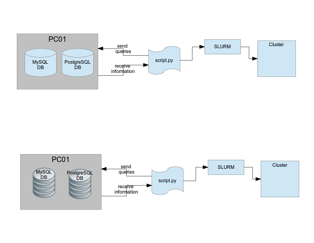


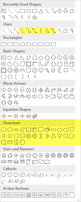

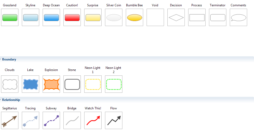
moosecompained about. It might be still beneficial for other users who will find this Q&A later. As you can see, no one (including myself:) gave solid answer so far.